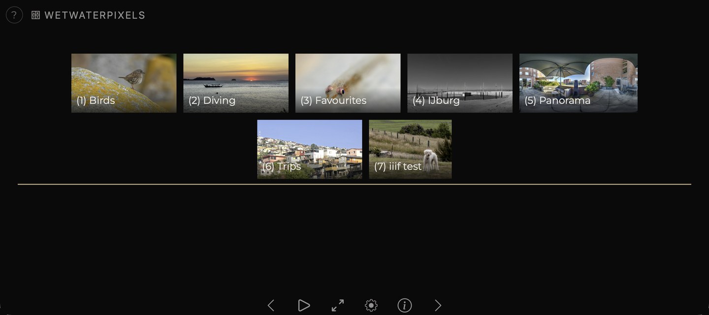
 Figure 1: main screen
Created from a personal need to share photos without any distractions or dependencies on private platforms.
Photos First.
Figure 1: main screen
The screen has three parts.
A top bar. At the far left, a ? opens a summary of the keys and gestures see The help panel. Next to it, a button showing a grid icon and the name of the current album; a click on it moves one level up, to the album containing this one.
The center area Albums appear above, with the photos belonging directly to the currently selected album below. When an albumn is selected that contains no (sub)albums, the album section stays put, just the photo thumbnails are replaced. The photo viewer, info and edit panels, share this space.
A bottom button bar.
| Button | Function |
|---|---|
| previous photo | |
| start the slideshow | |
| stop the slideshow (shown while one is running) | |
| full screen on or off | |
| settings | |
| keys and gestures (on a phone or tablet; on a larger screen this sits at the top left) | |
| edit this album or photo (signed in only) | |
| show or hide information | |
| next photo |
 Figure 2: button bar
Albums hold photos, and may contain other albums. The "Travel" album might hold "Norway 2023" and "Portugal 2024", which hold photos and potentially further albums.
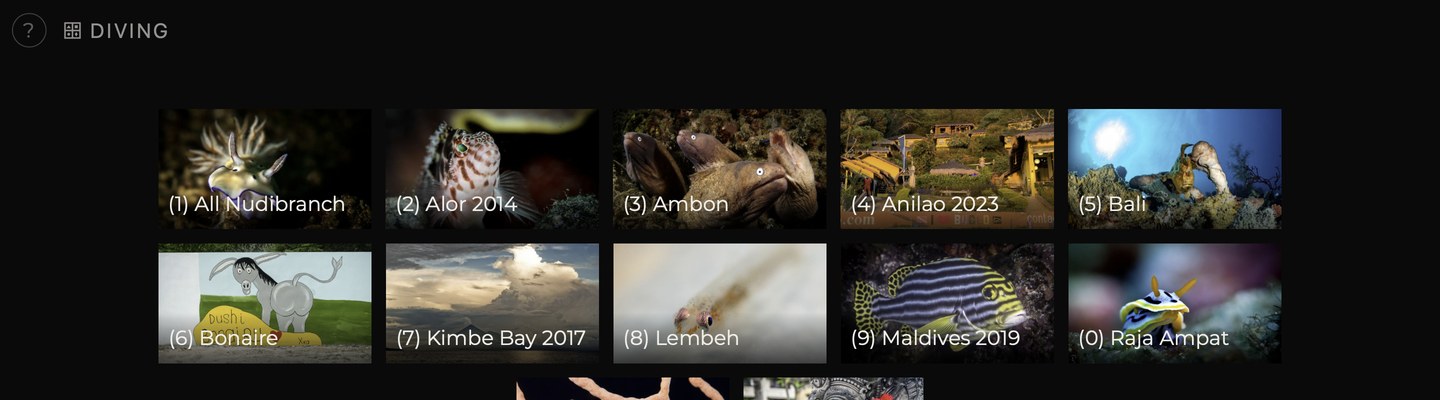 Figure 3: album tiles
An album tile shows one of the album's cover photos, or, with album tiles set to info in the settings, the album's info image, or the info image from top level album when it has none.
Below the album tiles are thumbnails of the photos belonging to the selected album.
On the opening screen, this section starts with up to three larger photos side by side. They are picked at random on every visit from a published album called Favourites (or Favorites, Picks, Favorieten ) and the published albums inside it; without one, from the photos marked cover. Videos, panoramas and iiif images are never picked. The number is set under photos on the home page in the settings.
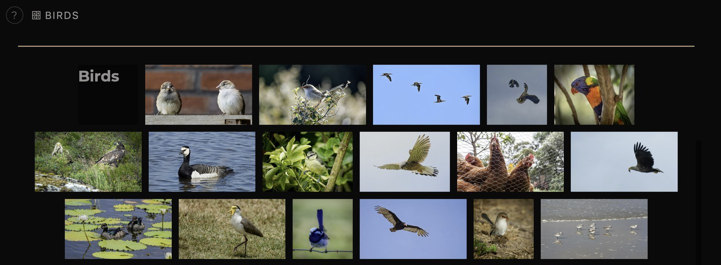 Figure 4:
thumbnail grid
Photos in an ordinary album appear in a different order on each visit by default. Albums marked as a trip hold photos in the order they were taken, earliest first, by default; the order can be set per album with photo order in the album edit panel see Editing an album.
Click or tap a thumbnail to open the photo at full size.
Large screens receive the full-size version of each photo, smaller screens a smaller one, which also loads faster on slow connections.
There is support for video, iiif images and 360° panorama's. These open in appropriate viewers.
Panoramas A full-surround 360° image. Opens in a viewer that can be turned by dragging with the mouse or a finger. On a phone or tablet the handset itself can be moved to look around; permission for the motion sensor is requested the first time.
Video A video clip starts playing when it comes into view and stops when another photo is selected.
Ultra high-res Support for very high resolution images in IIIF format. These open in a viewer that supports zooming and panning: scroll or pinch to magnify, drag to move around.
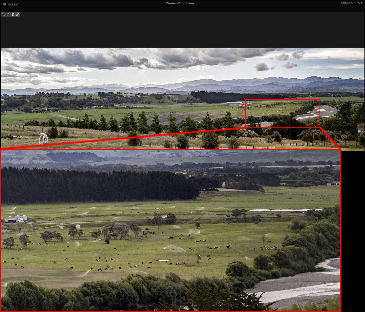 Figure 5: iiif
image
On a phone, the and buttons remain visible for panoramas and deep-zoom images, since a swipe there turns or pans the view rather than advancing to the next photo.
The button, or the i key, shows the details behind the current album or photo.
For an album: the album's info picture, the number of photos, the location, the description, and the range of dates over which the photos were taken. For a trip, the dates of the trip.
For a photo: title, subtitle, location, date taken and description, alongside the camera details body, lens, focal length, aperture, shutter speed and ISO. The camera details can be hidden for the whole gallery with show camera info in the settings.
Where the photo carries coordinates, a show on map link opens a map in a new window at the position of the photo.
When signed in, the photo panel also shows the photo's number, whether it has an HDR gain map, and whether it is marked as a candidate cover image.
Pressing again closes the panel.
The ? at the top left of the screen, in the button bar on a phone or tablet, or the ? key summarises everything the gallery responds to: the keys, the gestures, and the editing shortcuts. It appears below the top bar and closes again on any key, tap or click.
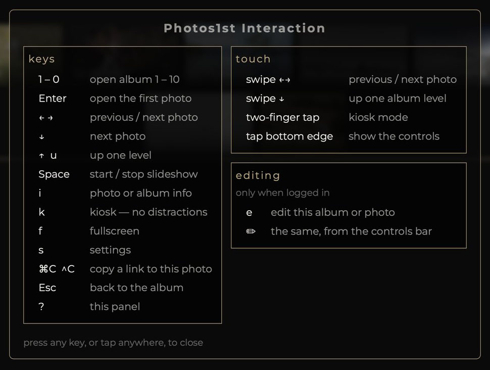 Figure 6: The help panel.
The button, or the space bar, starts a slideshow. A thin bar along the bottom of the screen indicates the time remaining on the current photo.
The button or the f key removes the browser interface, leaving only the photos. The same button, or Escape, restores it.
The k key (kiosk mode) hides the top bar and the button bar, leaving nothing around the photo. The arrow keys and the slideshow continue to work. Pressing k again restores the bars. On a touch device a two-finger tap toggles kiosk mode.
Used together, the two produce a clean display suitable for a large screen, a presentation or an exhibition.
The button, or the s key, opens the settings window. It is divided into sections; site appears only when signed in.
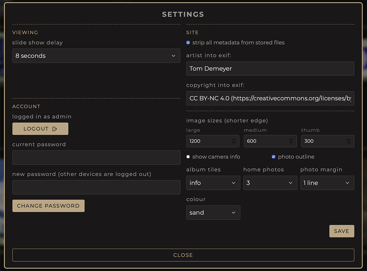 Figure 7: settings window, when signed in.
Viewing slide show delay. A list with 4, 8 and 15 seconds, half a minute, etc. A new choice applies at once, also to a slideshow that is already running. It is stored on the device and applies to subsequent visits.
Site section (only when signed in). Settings for the whole gallery, these are stored on the server:
| Field | Purpose |
|---|---|
| strip all metadata from stored files | 'On' removes all information carried in the new uploads, except the artist and copyright. The colour profile and any HDR gain map are kept as well. |
| artist into exif | The name written into every stored image as its artist. Leave empty to keep whatever the photo file itself says |
| copyright into exif | Likewise for the copyright notice, for instance a licence such as
CC BY-NC 4.0 |
| image sizes (shorter edge) | The size in pixels of the shorter side of the large, medium and thumb |
| show camera info | 'On' shows the camera details in the photo info panel; 'off' hides them for everyone. Takes effect at once, for all photos |
| album tiles | 'Info' shows each album's info image on its tile, the home album's info image where an album has none; 'photo' shows a random cover photo from the album. Takes effect at once, for everyone |
| home photos | How many featured photos the opening screen shows: none, 1, 2 or 3 |
| photo margin | Extra space around the photo in the viewer, in lines of text: none to 5. Takes effect at once, for everyone |
| photo outline | 'On' draws a thin grey line around the photo in the viewer |
| colour | The accent colour of buttons, borders and headings. Picking one previews it; after save it takes effect at once, for everyone |
Account. When signed out: admin login, the password field see Signing in. When signed in: logout, and change password: type the current password and the new one (at least 8 characters), then press change password. Every other device that was signed in is signed out; this one stays signed in.
The gallery can be operated entirely from the keyboard. These keys are active except while typing into a field.
| Key | Function |
|---|---|
| → or ↓ | next photo |
| ← | previous photo |
| ↑ or u | move up to the album above, or close the photo |
| Enter | open the first photo in the album |
| Escape | close any window and return to the overview |
| space | start or stop the slideshow |
| i | show or hide information |
| f | full screen on or off |
| k | toggle kiosk mode |
| s | settings |
| e | open or close the edit panel (signed in only) |
| ? | the keys and gestures summary |
| 1–9, 0 | open the album with that number |
| ⌘C / Ctrl-C | copy a link to the photo on screen (when no text is selected) see Sending someone a link |
The address in the browser's address bar follows the current position in the gallery. Copying and sending it brings the recipient to the same album.
To share one particular photo, open it and press ⌘C (Ctrl-C on
Windows and Linux). This copies an address of the form
…/collections/12/photo/345, which opens the album with that
photo on screen. When the album was opened with a secret link, the
secret is included, so the recipient can see it too.
Instructions may be appended to the address, after a question mark:
| Appended to the address | Effect |
|---|---|
?slideshow=10 |
the album opens and begins a slideshow at 10 seconds a photo |
?kiosk |
the album opens without the top bar and button bar |
?secret=yourcode |
opens a hidden album see Who can see what |
Instructions combine with & between them, for
example ?kiosk&slideshow=15. A single address of this
form is sufficient to drive an unattended display in a waiting room or
at an exhibition.
The remaining sections concern the upkeep of the gallery: creating albums, adding photos and maintaining their details. All of it requires signing in.
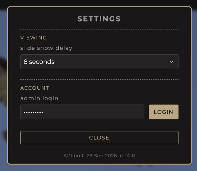 Figure 8: signing in.
The page reloads, and albums and photos hidden from ordinary visitors become visible. The settings window then shows the site section and a logout button. A wrong password simply leaves you signed out.
The sign-in lasts a week on that device; after that, sign in again. Changing the password in the settings signs out every other device at once.
The signed-in state persists on the device until logout, so log out on shared or public computers.
Open the album and press e, or use the button in the button bar. The edit panel opens below the top bar.
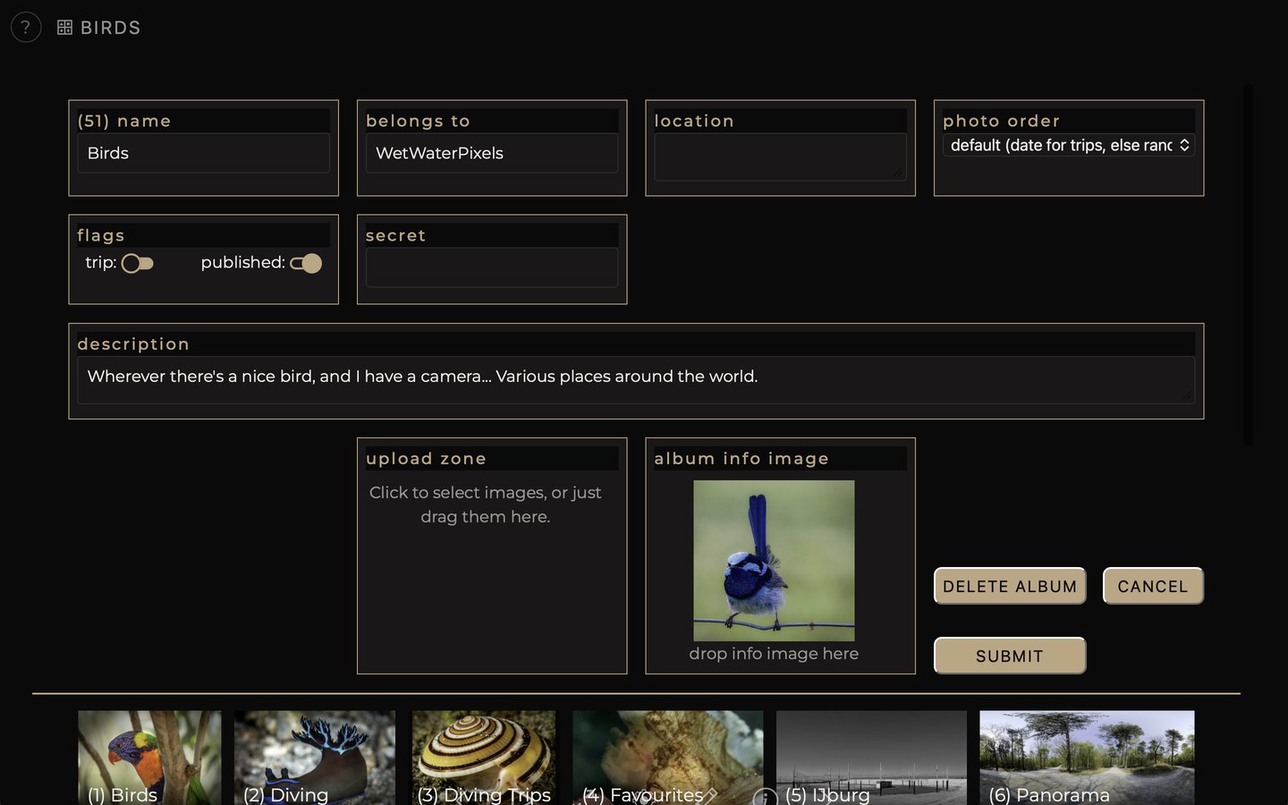 Figure 9: album edit panel.
| Field | Purpose |
|---|---|
| name | The album's name, as shown beneath its tile |
| belongs to | Click this field to select the parent album |
| location | The place or region, shown in the info panel |
| date | The dates of the trip; present only when trip is on |
| photo order | How the album's photos are ordered: default is by date for a trip, otherwise shuffled on each visit |
| flags | Two switches, described below |
| secret | A secret word permitting access to an unpublished album, or photos marked 'private' |
| description | Free markdown text about the album |
| Upload Zone | Add photos, see the next section |
| Album Info Image | The picture at the top of the info panel, or album thumbnail |
Jun 2024 / Jul 2024. A single month is sufficient where the
range is one month: Sep 2023 is equivalent to
Sep 2023 / Sep 2023.Formatting the description. The description field accepts markdown formatting
Markdown text is replaced by the formatted text it describes; plain text is equally acceptable.
The info picture is replaced by dragging an image onto the Album Info Image box JPG, PNG or AVIF. A preview appears immediately; submit commits it.
Open the album's edit panel with e, or the button, and use the Upload Zone box.
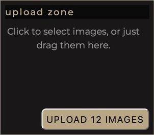 Figure 10: The upload zone.
Either drag the photos from the desktop onto the box, which highlights as they pass over it, or click the box and select them several at once if required in the window that opens.
A button in the corner of the box then reads upload 12 images, or the appropriate count. Pressing it sends the photos; pressing submit sends them together with the rest of the changes.
The photos are sent one at a time; the button counts down (uploading… 7 to go). When the last one is done, the album reloads by itself and the new photos appear. Photos that could not be processed are listed together in one message at the end, with the reason for each.
Accepted formats: JPG and AVIF, with or without gain map. Other files are refused.
Each photo is prepared in three sizes, and its camera details and coordinates, where present, are read from the uploaded file. Section 17 describes this processing in detail.
Open the photo and press e, or use the button in the button bar.
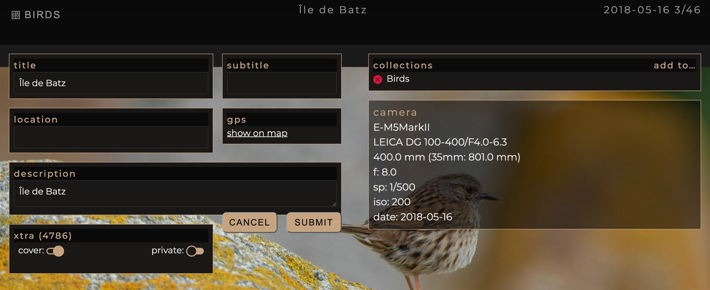 Figure 11: photo edit panel.
| Field | Purpose |
|---|---|
| title | The title, shown in the top bar |
| subtitle | A second line below the title. For a panorama, video or iiif this field is labelled differently and holds the name of the associated file; leave it unchanged |
| location | Where the photo was taken |
| GPS | Reference only; show on map opens the map |
| description | Free text, using markdown as with the album description |
| cover | 'On' permits this photo to serve as the sample picture on the album tile. When none are marked, the gallery selects one itself. |
| private | 'On' hides the photo from ordinary visitors |
| collections | The albums this photo belongs to; a photo may appear in several at once |
| add to… | lists the albums the photo can be added to (trips and the opening screen excepted); selecting the x before an album name removes the photo from that album. The name is struck through and the image disappears from the album on saving. |
| camera | details read from the photo file: camera, lens, focal length, aperture, shutter speed, ISO and date taken. These are not editable. |
Deleting a photo. Strike through every album the photo belongs to and press submit. You are asked for confirmation, then the photo is deleted for good; cancelling leaves everything as it was.
Three options determine what a visitor is shown.
published, 'On': the album is public and reachable by any visitor. 'off': it is absent from every listing and cannot be reached by guessing.
secret, This shares an unpublished album with a
defined group. Set a secret word wedding2024, for instance
and distribute the album's address with ?secret=wedding2024
appended. That link grants access while published remains off;
without it, nothing is visible. Also gives access to private
photos within the album.
private, For an individual photo that should not be shown in a public album. It is withheld from ordinary visitors and never shown to them. It remains visible while signed in and, inside the album, for people holding the album secret.
| Situation | Ordinary visitor | Visitor with the secret link | Signed in |
|---|---|---|---|
| album published on | sees the album | sees the album | sees the album |
| album published off, secret word set | sees nothing | sees the album | sees the album |
| photo with private on | does not see the photo | sees the photo | sees the photo |
An uploaded photo passes through several steps before it appears in the gallery.
The following exif data is read out and applied:
| Field filled in | Source |
|---|---|
| title | The title field, or the caption where no title is present |
| subtitle | The part of the title following a semicolon |
| description | The caption if present |
| location | Free field. When it starts with 'dive site: special formating is expected, read from dive log and stored in 'userdata' exif |
| camera, lens, focal length, aperture, shutter speed, ISO | Camera details and settings |
| coordinates | The position recorded by the camera or phone |
| date taken | The date of the exposure |
The semicolon convention allows both lines to be set from one field:
a title of Great Tit; Parus major yields "Great Tit" as the
title and "Parus major" as the subtitle. Everything imported this way
can be amended afterwards in the photo's edit panel.
When a file carries no date, the photo is assigned one in the distant past (December 11, 1413), which makes photos lacking a date straightforward to identify.
Each photo is prepared in three versions: large, medium and small (thumb), all in the AVIF format irrespective of what was uploaded. The gallery selects between them automatically small for thumbnails, medium for phones and small windows, large for full-size screens. Their sizes are set in the settings window. A photo smaller than a requested size is kept at its own size rather than enlarged.
Photos that carry an HDR gain map keep it in all three versions, and are shown in high dynamic range on screens and in browsers that support it.
Panoramas, video clips and iiif images are uploaded separately (for now). What is uploaded through the gallery is a stand-in image a still from the video, an overview of the panorama, a fixed view of the iiif; the literal filename of this image is what determines the type on the server:
| Name of the uploaded file | Resulting type |
|---|---|
pano.jpg |
panorama |
video.jpg |
film |
iiif.jpg |
iiif image |
Afterwards, open the photo, press e, and enter the name of the associated panorama directory, video file or iiif folder in the second field labelled pano dir, video file or subtitle accordingly.
The Album Info Image is handled separately: it is cropped to a square from the centre, and all information in the file is cleared except the photographer's name and the copyright notice it carried.
Resizing and reading take a moment per photo; can be an appreciable amount for fifty. Photos are processed one after another as they arrive; the upload button shows how many are still to go, and the album refreshes when all are done.
Image sizes, the artist and copyright credit, stripping, camera info, album tiles and the administrator password are changed in the settings window while signed in. The server's settings file only supplies their starting values, when the gallery is first started. The rest is held in that settings file and adjusted by whoever administers the server.
| Parameter | Where | Effect |
|---|---|---|
| large, medium, thumb | settings window | shorter edge in pixels of each version |
| artist, copyright | settings window | written into every new upload unless empty |
| strip all metadata | settings window | new uploads keep only artist and copyright |
| show camera info | settings window | camera details in the photo info panel, for everyone |
| administrator password | settings window | the sign-in secret; the server settings file holds the first one |
| storage locations | server settings file | where photos, films and panoramas are held |
| album tiles | settings window | info image or cover photo on each album's tile; the server settings file holds the first choice |